
In the high-stakes world of brand strategy, color is rarely just a visual preference; it is a psychological trigger, a silent communicator of value, and a cornerstone of market positioning. When we ask, “What color is blonde?” we are not discussing the biological pigments of hair. Instead, we are exploring a sophisticated spectrum of neutrals—ranging from champagne and cream to honey and sand—that has become the hallmark of modern “quiet luxury” and premium brand identities.
In the context of corporate identity and personal branding, blonde is the color of refined warmth. It occupies the critical space between the sterile coldness of pure white and the aggressive opulence of bright gold. For designers and brand strategists, mastering the “blonde” palette means understanding how to evoke feelings of heritage, organic quality, and understated wealth.

Decoding the Blonde Spectrum: More Than Just a Shade
To define what color blonde is within a branding framework, one must look at the intersection of yellow, brown, and white. Unlike a primary yellow, which signals caution or budget-friendly energy (think IKEA or Nikon), blonde shades are desaturated. They are complex neutrals that absorb and reflect light in ways that suggest texture and depth.
The Shift from Clinical White to Warm Blonde
For the past decade, the “Apple-esque” minimalist aesthetic dominated the branding landscape. This relied heavily on stark whites and cool grays to communicate tech-forward efficiency. However, as the market moved toward a desire for “human-centric” design, brands began migrating toward the blonde spectrum. This shift represents a move from the clinical to the comfortable.
Blonde hues—often categorized as “oat,” “linen,” or “bisque”—provide the same clean slate as white but with an added layer of approachable sophistication. In digital design, these colors reduce eye strain and create a sense of “organic tech,” a trend favored by wellness apps, sustainable fashion labels, and high-end skincare brands.
The Science of “Warm Neutrality”
The blonde palette functions as a “warm neutral.” In color theory, warm neutrals are used to create a sense of stability and reliability without the boredom often associated with plain beige. When a brand identifies as “blonde,” it is strategically positioning itself as an entity that is both established and welcoming. It lacks the intimidation factor of high-contrast black and white, making the brand feel more like a lifestyle partner than a distant corporation.
The Psychology of Blonde: Trust, Luxury, and Accessibility
Every color in a brand’s guidelines must serve a purpose. The psychology of blonde is rooted in its association with natural elements: sun-bleached wood, expensive fibers like silk and cashmere, and the effervescence of champagne. These associations allow a brand to tap into existing consumer perceptions of high-quality living.
Evoking Premium Comfort
Blonde is the primary color of the “Coastal Grandmother” and “Old Money” aesthetics that have recently revitalized brand marketing. By using shades of blonde, brands like Jenni Kayne or Goop communicate a specific type of luxury that isn’t about “bling” or overt logos. It is about the comfort of high-quality materials. When a consumer sees a blonde-heavy brand identity, their subconscious associates it with soft textures and premium craftsmanship. This is particularly effective for direct-to-consumer (DTC) brands that need to justify a higher price point through visual storytelling.
The Balance of Accessibility and Exclusivity
One of the most difficult feats in brand strategy is appearing exclusive yet accessible. Pure gold can often feel too “loud” or exclusionary, while yellow can feel too “cheap.” Blonde is the strategic middle ground. It suggests a high-end experience that is still attainable and grounded. For a personal brand, wearing or using blonde tones in photography and web design suggests that the individual is successful but relatable—a “mentor” figure rather than a “monarch.”
Technical Mastery: Bringing Blonde to Life Across Digital and Physical Touchpoints
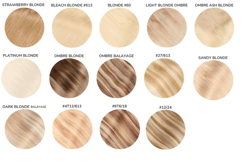
Defining what color blonde is requires a technical eye. Because blonde is a nuanced color, it is notoriously difficult to maintain consistency across different media. A shade that looks like soft honey on an iPhone screen (OLED) might look like muddy tan on a printed business card or a dull yellow on a laptop (LCD).
Finding the Perfect Hex: The Designer’s Dilemma
In the digital space, “blonde” isn’t a single HEX code. It is a family of codes that strategists must curate based on the brand’s “temperature.”
- Champagne (#F7E7CE): Used for heritage brands and luxury spirits to evoke celebration.
- Harvest Gold (#DA9100 desaturated): Used for brands focusing on nature and tradition.
- Cream/Parchment (#F5F5DC): Used for high-end editorial and minimalist fashion.
Strategists must also account for “web-safe” versions and how these colors interact with typography. Blonde often requires high-contrast accents—like charcoal or deep espresso—to ensure readability and ADA compliance in web design. A common mistake in “blonde” branding is a lack of contrast, which can make a brand look washed out or unprofessional.
Texture and Finish: The Role of Materiality
In physical branding—packaging, signage, and stationery—the “color” of blonde is heavily influenced by the finish. A matte blonde on a heavy-weight cardstock feels “earthen” and “artisan.” A metallic or pearlescent blonde on a cosmetic bottle feels “radiant” and “anti-aging.” Brand strategists must specify not just the color, but the tactile experience. For example, a luxury hotel might use a blonde wood grain as part of its visual identity, where the “color” is actually a natural texture that communicates warmth and hospitality.
Blonde as a Competitive Advantage: Industry-Specific Applications
Different industries utilize the blonde palette to solve specific marketing challenges. By analyzing how these sectors define the color, we can see its versatility as a strategic tool.
Beauty and Wellness: The Radiance Factor
In the beauty industry, “blonde” is synonymous with “glow.” Brands like Estée Lauder or Charlotte Tilbury use rose-gold and champagne-blonde tones to symbolize the effect their products have on the skin. Here, the color functions as a promise of a result. It isn’t just a background color; it is a visual metaphor for vitality and light.
Real Estate and Hospitality: Designing for Sophistication
In high-end real estate, “blonde” is the color of the “modern Scandinavian” or “Japandi” style. Branding for new developments often uses these tones to signal that the space is filled with natural light. It moves away from the dark mahoganies of the past (which felt heavy and patriarchal) toward a lighter, more gender-neutral version of power and success.
Finance and Fintech: The New Face of Wealth
Interestingly, even the finance sector is adopting the blonde palette. Traditional banks have long used navy blue to signal security. However, new-age wealth management firms and fintech apps are opting for “warm sands” and “soft creams.” This shift is designed to appeal to younger investors who view wealth not as a vault to be locked, but as a resource to be grown organically. The color blonde helps these brands feel less like “the establishment” and more like a modern, lifestyle-aligned financial partner.
Case Studies: Brands that Mastered the Blonde Aesthetic
Several global brands have effectively “owned” a specific slice of the blonde spectrum, using it to differentiate themselves in crowded markets.
- Veuve Clicquot: While often described as “yellow,” the brand’s iconic label is actually a deep, “yolk-blonde.” This color was a radical departure when it was introduced, intended to make the bottles stand out in dark wine cellars. Today, that specific shade of blonde is inseparable from the brand’s identity of bold luxury.
- Burberry: The “Haymarket Check” is built on a foundation of a specific, sandy blonde. This color communicates the brand’s British heritage and its focus on outdoor durability (the trench coat) while maintaining a high-fashion edge. It is a masterclass in using a neutral as a primary brand identifier.
- West Elm: The furniture retailer uses a “blonde wood” aesthetic across its branding and product lines to appeal to urban professionals. The color signals that their products are modern, light enough for small apartments, yet warm enough to feel like a “home.”

Building a Timeless Brand with a Blonde Foundation
As we conclude the exploration of “what color is blonde,” it is clear that this palette is far more than a trend. It is a strategic choice for brands that want to communicate longevity without appearing dated. Unlike “Millennial Pink” or “Electric Blue,” which have clear expiration dates, the blonde spectrum is rooted in the natural world, making it inherently timeless.
For brand strategists, the key to using blonde lies in its execution. It requires a delicate balance of saturation, a keen understanding of lighting and texture, and a commitment to high-contrast pairings. When done correctly, a blonde brand identity does not just look “nice”—it feels expensive, it feels trustworthy, and most importantly, it feels like a destination.
Whether you are launching a new luxury line or rebranding a personal identity, the blonde palette offers a path to “quiet authority.” It is the color of a brand that doesn’t need to shout to be heard, relying instead on the subtle, undeniable pull of refined warmth and sophisticated neutrality. In the world of brand strategy, blonde isn’t just a color—it’s a statement of intent.
aViewFromTheCave is a participant in the Amazon Services LLC Associates Program, an affiliate advertising program designed to provide a means for sites to earn advertising fees by advertising and linking to Amazon.com. Amazon, the Amazon logo, AmazonSupply, and the AmazonSupply logo are trademarks of Amazon.com, Inc. or its affiliates. As an Amazon Associate we earn affiliate commissions from qualifying purchases.