
In the competitive landscape of the National Football League (NFL), a team’s visual identity is far more than an aesthetic choice; it is a multi-billion dollar corporate asset. When fans and analysts ask, “What color are the Philadelphia Eagles?” the answer is not merely a single shade of green. It is a sophisticated palette designed to evoke specific psychological responses, maintain brand equity, and differentiate the franchise in a crowded global marketplace.
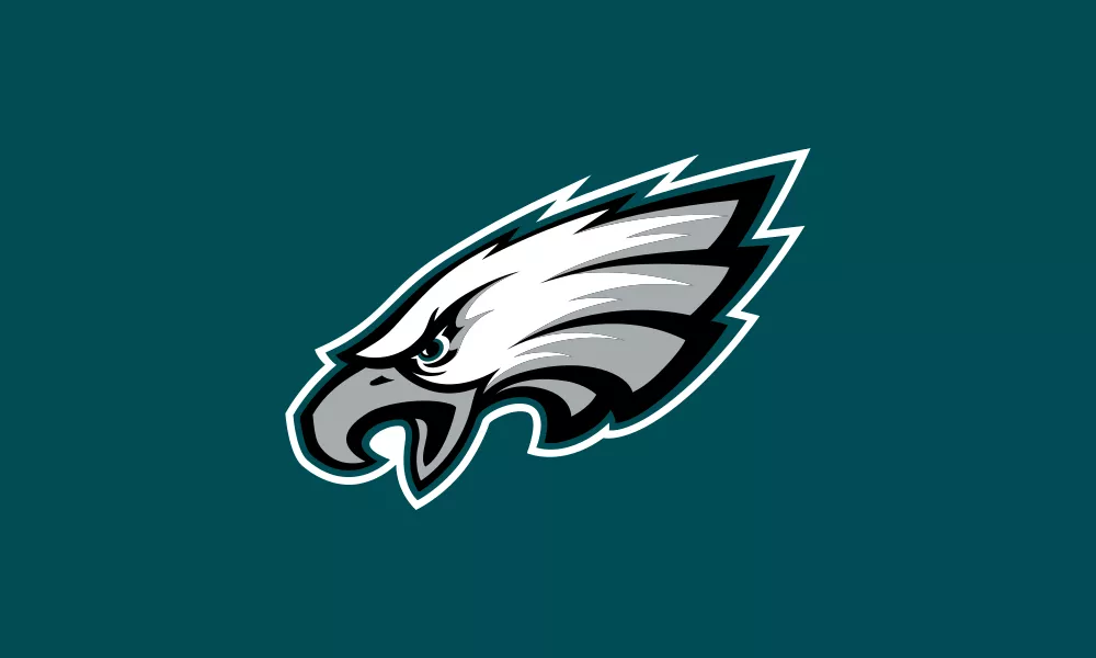
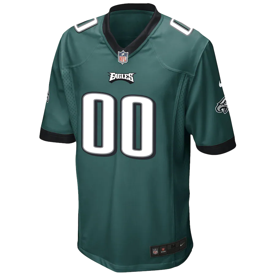
The primary color of the Philadelphia Eagles is Midnight Green, a custom-engineered hue that serves as the cornerstone of their corporate identity. However, understanding this brand requires looking deeper into the strategic evolution of the franchise, the technical specifications of their design language, and the way they leverage nostalgia to drive commercial success.
The Strategic Evolution of Midnight Green
The history of the Philadelphia Eagles’ brand identity is a masterclass in calculated evolution. For much of the 20th century, the team was defined by “Kelly Green”—a bright, vibrant, and traditional shade of green that echoed the classic eras of professional football. However, in 1996, under the ownership of Jeffrey Lurie, the franchise underwent one of the most successful rebrands in professional sports history.
The Shift from Kelly Green to Modernity
The transition from Kelly Green to Midnight Green was not an arbitrary decision. It was a strategic move to modernize the franchise and align it with a more aggressive, professional, and “premium” aesthetic. During the mid-90s, the NFL was seeing a shift in design trends. Teams were moving away from primary, high-saturation colors toward darker, more metallic, and sophisticated tones.
Lurie’s vision was to create a visual identity that felt permanent and powerful. Midnight Green—a deep, teal-infused dark green—was the result. This color was designed to stand out under the high-definition television lights and to look just as prestigious in a corporate boardroom as it does on the turf of Lincoln Financial Field.
Building Brand Equity through Differentiation
In a league where several teams utilize green (such as the New York Jets and the Green Bay Packers), the Philadelphia Eagles needed a unique signature. By opting for a custom dark teal-green, the Eagles secured a unique visual niche. This differentiation is critical for trademarking, licensing, and merchandising. When a consumer sees that specific shade of Midnight Green, there is an immediate, subconscious association with the Philadelphia Eagles, reinforcing brand recall and loyalty.
The Psychology and Semantics of the Eagles’ Color Palette
A successful brand strategy relies heavily on color psychology. The Eagles’ palette is composed of four primary colors: Midnight Green, Silver (Metallic), Black, and White. Each of these plays a specific role in how the brand is perceived by the public.
Midnight Green: Power and Sophistication
Green is traditionally associated with growth, energy, and renewal. However, by darkening the shade to “Midnight,” the Eagles’ brand designers added layers of mystery, sophistication, and gravity. Unlike the “friendly” Kelly Green of the past, Midnight Green feels formidable. In a sports context, where the goal is to project strength and intimidation, this darker hue serves a functional psychological purpose.
Silver and Charcoal: The Metallic Modernist Edge
The use of silver and charcoal accents provides a sleek, industrial feel. These colors are often associated with technology, precision, and the “Silver Lining” of success. Within the Eagles’ brand architecture, silver is used to outline the primary logo and the jersey numbers, providing a high-contrast “pop” that ensures legibility—a crucial factor in both broadcast media and stadium visibility.
The Aggressive Use of Black
Black is the color of authority and elegance. The Philadelphia Eagles have strategically integrated black into their “Alternative” brand identity. The introduction of the all-black uniform was a direct response to consumer demand and the “cool factor” associated with urban fashion. From a marketing perspective, the black uniforms allow the team to tap into a younger demographic, moving the brand beyond the field and into the realm of streetwear and lifestyle branding.
Technical Consistency: Pantone, Hex, and RGB

For a global brand like the Philadelphia Eagles, color consistency is a logistical challenge. The “Eagles Green” must look identical whether it is displayed on a smartphone screen, printed on a season ticket, or dyed into the fabric of a $300 jersey. This requires rigorous adherence to technical brand standards.
The Specs of the Philadelphia Eagles Brand
To maintain the integrity of the corporate identity, the Eagles utilize specific color codes across different media:
- Pantone Matching System (PMS): 316 C
- Hex Code: #004C54
- RGB: (0, 76, 84)
- CMYK: (100, 0, 30, 70)
These specifications are the “DNA” of the brand. If a partner or licensee produces merchandise that deviates from these values—perhaps making the green too blue or too light—it dilutes the brand equity and creates a fragmented visual experience for the consumer.
The Nike Flywire Challenge
A notable case study in brand management occurred in 2014 when Nike took over the NFL’s uniform manufacturing. The complex “Midnight Green” was notoriously difficult to replicate on Nike’s new Elite 51 uniform fabrics. Because the color is a specific blend of cyan and black with metallic undertones, the early versions of the jerseys didn’t match the team’s helmets. This led to a significant delay in the rollout of the team’s primary jerseys. This incident highlighted the importance of technical precision in brand execution; the Eagles were willing to delay their merchandise launch rather than take the field in a color that was “close enough” but not brand-accurate.
The Power of Nostalgia: Managing the Kelly Green Revival
In recent years, the Eagles have demonstrated a masterful understanding of “Legacy Branding” by reintroducing Kelly Green as an alternate color. This move shows how a brand can manage its history as a secondary revenue stream without compromising its primary identity.
Nostalgia as a Marketing Tool
For older fans, Kelly Green represents the era of Chuck Bednarik and Randall Cunningham. For younger fans, it represents a “retro-cool” aesthetic. In 2023, when the Eagles officially brought back Kelly Green for select games, the merchandise sales broke franchise records.
From a brand strategy perspective, this was a brilliant move. It allowed the franchise to:
- Monetize the Past: Sell an entirely new line of apparel to a fan base that already owned Midnight Green gear.
- Increase Engagement: Generate massive social media buzz and traditional media coverage during the “off-peak” jersey reveal cycles.
- Strengthen Emotional Bonds: Validating the history of the franchise reinforces the “Eagles for Life” mentality among the fan base.
Balancing Two Identities
The challenge of using two distinct shades of green is ensuring they do not compete. The Eagles have successfully positioned Midnight Green as the “Professional, Championship-Era” identity, while Kelly Green is the “Heritage, Celebration” identity. This clear hierarchy prevents brand confusion while maximizing market reach.
The Impact of Visual Identity on Commercial Success
The color of the Philadelphia Eagles is ultimately a tool for revenue generation and market positioning. In the world of sports business, your colors are your “packaging.”
Merchandising and Retail Dominance
The Eagles consistently rank in the top tier of NFL merchandise sales. This is due in no small part to the “wearability” of their color palette. Midnight Green and Black are colors that translate well to everyday fashion. Unlike teams with neon or highly eccentric palettes, the Eagles’ colors are versatile, allowing fans to incorporate team gear into their daily wardrobes. This “lifestyle integration” is a key goal of modern brand strategy.
Digital Presence and Broadcast Clarity
In the digital age, a brand must be optimized for the “second screen.” The Eagles’ use of high-contrast white and silver against the deep Midnight Green ensures that their logo and player numbers are instantly recognizable on small mobile devices and in fast-paced social media clips. The “Eagle Head” logo, which is the only NFL logo to point to the left (to form a hidden “E” in the feathers), combined with the unique green, creates a visual signature that is impossible to miss.
Conclusion: More Than Just a Color
What color are the Philadelphia Eagles? They are a meticulously maintained ecosystem of Midnight Green, Silver, and Black. This palette represents more than just a team; it represents a multi-generational legacy, a sophisticated corporate entity, and a masterfully executed marketing strategy.
By balancing the modernity of Midnight Green with the strategic revival of Kelly Green, the Eagles have created a brand that is both forward-looking and deeply rooted in its history. In the world of corporate identity, the Eagles don’t just wear green—they own it. Their visual strategy serves as a blueprint for any organization looking to build a brand that is recognizable, emotionally resonant, and commercially unstoppable.
aViewFromTheCave is a participant in the Amazon Services LLC Associates Program, an affiliate advertising program designed to provide a means for sites to earn advertising fees by advertising and linking to Amazon.com. Amazon, the Amazon logo, AmazonSupply, and the AmazonSupply logo are trademarks of Amazon.com, Inc. or its affiliates. As an Amazon Associate we earn affiliate commissions from qualifying purchases.