
In the competitive landscape of global commerce and visual identity, color is far more than an aesthetic choice. It is a psychological trigger, a cultural signifier, and a fundamental pillar of brand strategy. When businesses ask, “What is the most popular color in the world?” they are rarely looking for a simple trivia answer. Instead, they are seeking to understand the collective human psyche and how to leverage universal preferences to build trust, recognition, and market dominance.
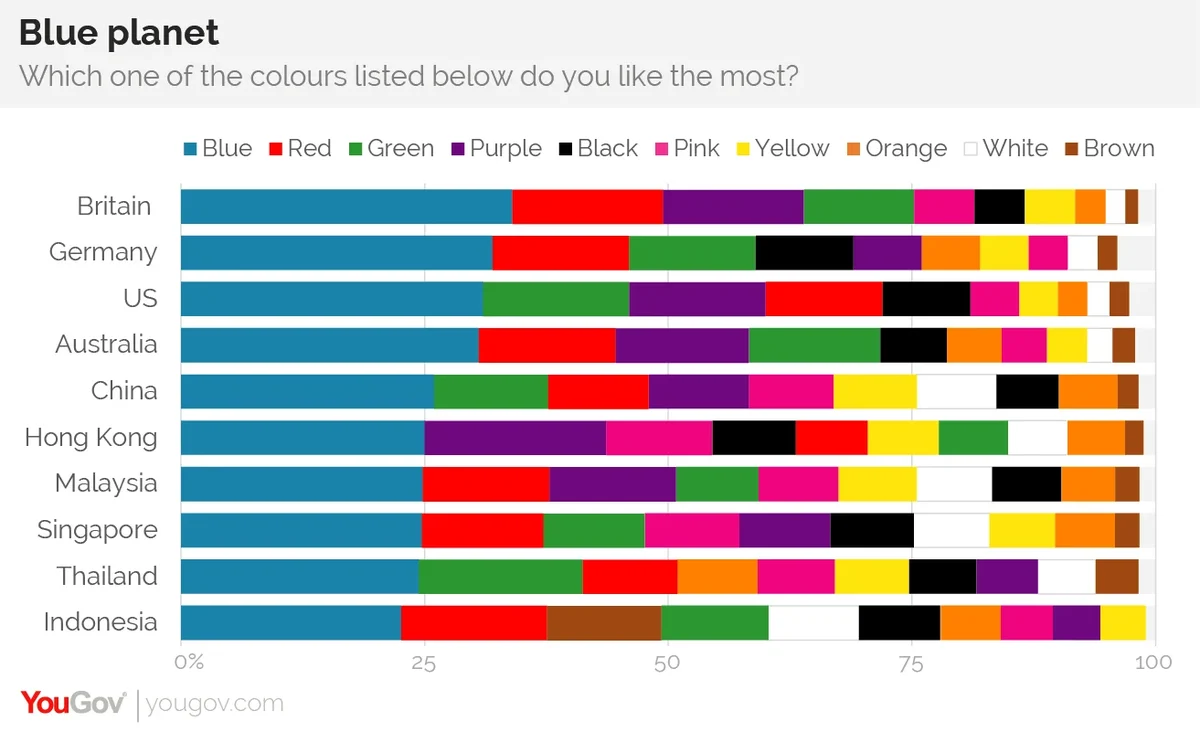
Statistically and cross-culturally, the answer is definitive: Blue. From the bustling markets of Southeast Asia to the corporate boardrooms of New York and London, blue consistently ranks as the favorite color of humanity. However, for brand strategists and marketing professionals, the true value lies not just in knowing that blue is popular, but in understanding why it holds such a profound grip on the global imagination and how that popularity dictates the way brands are built and perceived.
The Psychology and Global Dominance of Blue
The preference for blue is one of the few truly global constants in human behavior. Multiple large-scale studies, including those conducted by YouGov and various academic institutions across four continents, have consistently found that blue is the favorite color in every country surveyed. Whether it is a deep navy or a vibrant sky blue, this hue transcends borders, languages, and socioeconomic status.
The Evolution of Trust and Reliability
From a brand strategy perspective, the popularity of blue is rooted in its psychological associations with stability, tranquility, and reliability. These associations are not arbitrary; they are deeply embedded in our relationship with the natural world. Blue is the color of the clear sky and the calm ocean—two constants that, throughout human history, have signaled safety and predictability.
In corporate identity, this translates to a “safe” harbor. When a brand uses blue, it is communicating a promise of professionalism. It is why the world’s most established institutions—from the United Nations to the largest global banks—utilize blue as their primary identifier. It suggests an entity that is dependable, non-threatening, and built to last. For a new brand entering a volatile market, choosing the world’s most popular color can be a strategic move to shorten the “trust gap” between the company and its potential customers.
Cross-Cultural Versatility
Unlike red, which can signify “luck” in China but “danger” or “debt” in Western financial contexts, blue maintains a remarkably consistent positive valence across the globe. It rarely carries the baggage of strong negative taboos. This makes it the ultimate “safe bet” for multinational corporations that require a visual identity capable of functioning in diverse markets without the risk of misinterpretation. In the realm of brand strategy, blue is the linguistic equivalent of a universal bridge, allowing for a seamless transition of brand equity from one culture to another.
Why Top Global Brands Leverage the World’s Favorite Color
The dominance of blue is nowhere more visible than in the Fortune 500. A significant percentage of the world’s most valuable brands utilize blue as their primary brand color. This is not a coincidence or a lack of creativity; it is a calculated decision based on how color influences consumer perception and decision-making.
The Tech Giants and the Logic of Connection
If you look at the icons on your smartphone, you will notice a sea of blue. Facebook (Meta), LinkedIn, Twitter (X’s predecessor), Dell, HP, and Intel all rely on blue. In the technology sector, the color serves a dual purpose. First, it counters the “coldness” of hardware and software with a sense of approachable intelligence. Second, for social platforms, blue promotes a sense of community and communication.
In brand strategy, specifically within software and AI development, blue is used to lower the barrier to entry for users. New technologies can be intimidating; blue suggests that the technology is a tool designed for the user’s benefit rather than a complex or dangerous machine. It fosters an environment of productivity and calm focus, which is essential for digital tools meant for daily use.
Financial Services and the “Anchor” Effect
In the financial sector, the use of blue is nearly ubiquitous. Institutions like American Express, Chase, Visa, and PayPal utilize blue to project an image of fiscal responsibility and security. When consumers are entrusting an organization with their life savings or sensitive financial data, they are not looking for excitement or “disruption” in the visual sense—they are looking for an anchor.
The popularity of blue in this niche is about institutionalizing the brand. By aligning with the world’s most liked and trusted color, these brands tap into a subconscious assurance of solvency. The “anchor” effect of blue ensures that even during market volatility, the brand’s visual identity remains a beacon of perceived stability.
Marrying Consumer Preference with Strategic Differentiation
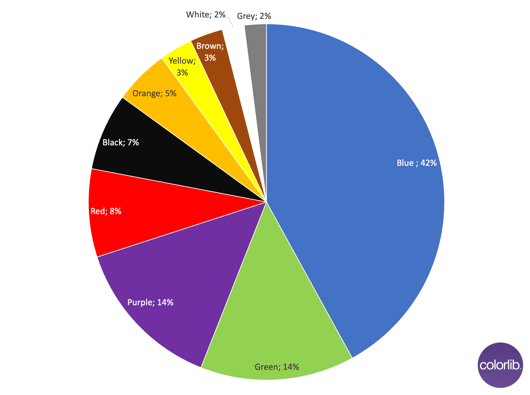
While blue is the most popular color, a common pitfall in brand strategy is the “sea of sameness.” If every brand in a specific industry chooses the world’s most popular color, the individual brand loses its ability to stand out. The challenge for modern designers and brand managers is to balance the universal appeal of blue with the need for distinct corporate identity.
The Risks of Over-Saturating with Popularity
When a color becomes too dominant within a category, it loses its psychological potency. This is known as “semantic satiation” in a visual context. If ten different banks in the same city all use the same shade of royal blue, the color no longer signifies “trust” specifically for one brand; it simply becomes the “uniform” of the industry.
Strategic branding requires looking at the “color gaps” in a market. For example, while blue is the most popular color globally, T-Mobile famously chose Magenta to disrupt the telecommunications industry. At the time, the market was dominated by the blues and reds of AT&T and Verizon. By intentionally avoiding the most popular color, T-Mobile positioned itself as a “rebel” and a “challenger,” proving that sometimes, the best way to leverage color is to go against the grain of global popularity.
How “Marrs Green” Challenged the Status Quo
In 2017, a massive global survey conducted by the paper merchant G.F Smith aimed to find the “World’s Favorite Color” more precisely. The winner was a specific teal-like shade named “Marrs Green.” This color sits at the intersection of blue and green, combining the calming properties of blue with the growth and vitality associated with green.
This discovery was a revelation for brand strategists. It suggested that while “blue” as a category is the most popular, there is a specific “sweet spot” where blue meets green that resonates deeply with modern consumers’ desires for both stability and ecological awareness. Brands that have adopted these “teal” or “petrol blue” shades are finding success in bridging the gap between traditional corporate reliability and contemporary environmental values.
Implementing Color Trends in Modern Brand Strategy
Understanding the world’s most popular color is only the first step. The second step is implementation—how to use this data to inform digital security, app development, and personal branding in a way that feels fresh and relevant.
Digital Accessibility and High-Contrast Design
In the digital age, color choice is also a matter of accessibility. Blue is often the preferred choice for hyperlinks and call-to-action buttons because it is one of the most distinguishable colors for people with various forms of color vision deficiency (CVD). Most people with red-green color blindness can still see blue clearly.
From a tech and UX (User Experience) perspective, using the world’s most popular color is often a functional requirement. Brand strategy now intersects with “Universal Design.” If your brand’s primary action color is accessible to the widest possible audience, your brand is inherently more inclusive and user-friendly.
The Shift Toward Minimalist Palettes
We are currently seeing a shift in corporate identity where the “most popular color” is being used more sparingly. Rather than drenching a brand in blue, modern strategy often utilizes a minimalist palette—lots of white space and neutral grays—with the popular color used as a high-impact accent. This approach allows the brand to benefit from the psychological positives of the color without overwhelming the consumer or appearing dated.
This trend is particularly prevalent in personal branding and boutique agencies. By using a “signature” shade of the world’s favorite color as an accent, a professional can project authority and likability while maintaining a modern, high-design aesthetic.
Beyond Popularity to Purposeful Identity
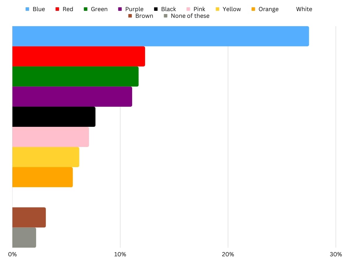
While blue remains the undisputed champion of the world’s color palette, the most successful brands are those that use this information as a foundation rather than a ceiling. Brand strategy is not about following a popularity contest; it is about the purposeful application of psychological insights to achieve a specific business objective.
The most popular color in the world provides a baseline of human preference. It tells us that, as a species, we value peace, clarity, and reliability. However, a brand’s true identity is forged in the nuances—the specific shade, the secondary palette, and the story told through visual consistency. Whether a brand chooses to lean into the universal popularity of blue or to strategically pivot toward a more niche hue, the goal remains the same: to create a visual shorthand that resonates with the hearts and minds of a global audience.
In the end, the popularity of a color is a tool. In the hands of a skilled strategist, it is the difference between a brand that is merely seen and a brand that is truly remembered. By understanding the global pull of our favorite hues, companies can build identities that are not just fashionable for today, but foundational for the future.
aViewFromTheCave is a participant in the Amazon Services LLC Associates Program, an affiliate advertising program designed to provide a means for sites to earn advertising fees by advertising and linking to Amazon.com. Amazon, the Amazon logo, AmazonSupply, and the AmazonSupply logo are trademarks of Amazon.com, Inc. or its affiliates. As an Amazon Associate we earn affiliate commissions from qualifying purchases.