
In the world of brand strategy, green has long been the undisputed champion of growth, sustainability, and harmony. It is the color of nature, the universal signal for “go,” and the visual shorthand for environmental responsibility. However, as markets become increasingly saturated with “eco-friendly” aesthetics, strategic designers and brand consultants are forced to ask a provocative question: What is the opposite of green?
The answer is multifaceted. From a technical color theory perspective, the opposite is magenta or red. From a psychological standpoint, it may be the synthetic, the industrial, or the urgent. From a strategic branding perspective, the opposite of green represents a departure from the “sea of sameness” found in sustainable marketing, moving toward identities that prioritize power, technology, or radical transparency over organic softness. Understanding these opposites is essential for any brand looking to differentiate itself in a crowded global marketplace.

The Visual Counterpoint: Magenta, Red, and the Psychology of Contrast
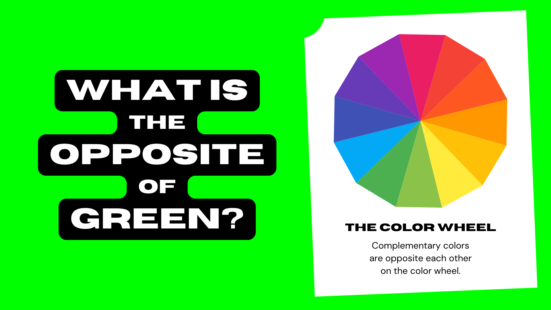
To understand the visual opposite of green, one must first look at the color wheel. Green sits directly across from magenta and its variations, including vibrant reds and deep purples. These colors represent a fundamental shift in brand energy. While green is recessive and calming, its opposites are aggressive, high-energy, and demanding of attention.
The Power of the Complementary Palette
Complementary colors—those situated opposite one another—create the highest possible contrast. In brand design, using the opposite of green is a tactic used to evoke immediate action. Where green suggests a brand that is patient and nurturing, magenta and red suggest a brand that is fast, bold, and disruptive.
Consider the branding of companies like Netflix or Coca-Cola. By embracing the “anti-green” (red), these brands signal appetite, excitement, and urgency. They do not want the consumer to feel relaxed; they want the consumer to feel engaged. For a brand strategist, choosing the opposite of green is often a move to capture the “mental availability” of a consumer in a high-speed environment.
Psychological Impact: Nature vs. Artifice
Green is intrinsically linked to the organic world. Therefore, its psychological opposite is often perceived as the synthetic or the digital. Brands that lean into neon pinks, electric blues, or stark magentas are positioning themselves as part of the “new world”—a world of technology, speed, and human-made innovation. This is particularly prevalent in the fintech and software-as-a-service (SaaS) sectors, where the goal is to look like the future, not the forest.
The Strategic Opposite: From Greenwashing to Radical Transparency
In the modern corporate identity landscape, “green” has become a value-laden term. It represents the “Green Economy”—the push toward sustainability and ESG (Environmental, Social, and Governance) goals. Consequently, the strategic opposite of green isn’t necessarily “dirty” or “polluting,” but rather a rejection of the performative aesthetics that often accompany environmentalism.
Navigating the Trap of Greenwashing
For many years, brands believed that simply adding a green leaf to a logo or using a palette of sage and forest green would signal trustworthiness. However, as consumers have grown more cynical, this “green” aesthetic has become a red flag for “greenwashing”—the practice of making a brand seem more environmentally friendly than it actually is.
The strategic opposite of this approach is “radical transparency.” Instead of hiding behind soft, organic visuals, brands are increasingly adopting industrial, stark, and data-driven identities. This “anti-green” branding uses high-contrast typography, monochromatic schemes, and unretouched imagery to signal honesty. By moving away from the traditional green aesthetic, these brands tell the consumer, “We aren’t trying to distract you with nature-based imagery; we are showing you exactly who we are.”
The “Brown” Economy and Industrial Authenticity
In some niche markets, the opposite of green is an intentional embrace of “brown” or industrial aesthetics. This is seen in heavy-duty tools, automotive parts, and legacy manufacturing. Here, the lack of green is a signal of durability and raw power. These brands do not claim to be delicate or “natural.” They claim to be indestructible. By positioning themselves as the opposite of the soft, green aesthetic, they appeal to a demographic that values utility over ideology.
Market Positioning: When to Pivot Away from the Green Aesthetic
Strategy is the art of sacrifice. To be everything to everyone is to be nothing to anyone. While the trend toward sustainability is global, there are specific scenarios where a brand should intentionally choose the “opposite of green” to secure a unique market position.

Breaking the “Sea of Sameness”
In categories like organic food, skincare, and renewable energy, green is the default. Walking down a grocery aisle of “natural” products reveals a monochromatic blur of olive, mint, and leaf-green packaging. For a new brand entering this space, the most effective strategy is often to adopt the visual opposite.
By using vibrant magentas, deep oranges, or even stark black and white, a brand can disrupt the consumer’s visual processing. This is known as the Von Restorff effect, or the isolation effect, which predicts that when multiple similar objects are present, the one that differs from the rest is most likely to be remembered. If every competitor is green, the “anti-green” brand wins the battle for attention.
Signaling Luxury and Exclusivity
Historically, green has been associated with the commonality of nature. In the luxury sector, the opposite of green—often represented by metallic golds, deep blacks, or royal purples—is used to signal exclusivity and artifice. Luxury branding is frequently about the “extra-natural”—the idea that the product is a result of human craftsmanship that transcends the natural state.
High-end jewelry brands or luxury automotive companies rarely lead with green. Instead, they use a palette that suggests the vault, the night, or the high-tech laboratory. This strategic distancing from green helps maintain an aura of prestige and “otherness” that nature-based branding cannot provide.
The Digital Divide: Green vs. Dark Mode and High-Tech Identities
In the realm of tech and software, the opposite of green is often defined by the “Dark Mode” aesthetic. While green is the color of the daytime world and photosynthesis, the high-tech world lives in the obsidian glow of code and screens.
The Rise of the Dark Aesthetic
Modern tech brands like Uber, Spotify, and various AI startups have moved away from the “bright and green” look of early 2000s tech (think of the rolling green hills of the Windows XP wallpaper). Instead, they have embraced the opposite: deep blacks, dark greys, and vibrant neon accents. This aesthetic signals sophistication, focus, and a 24/7 digital lifestyle.
This shift represents a move from the “organic” to the “algorithmic.” The opposite of green here is the void—a canvas of black that allows high-contrast data to pop. It is an identity built for the screen, not the field.
AI and the Synthetic Frontier
As we enter the era of Artificial Intelligence, the branding of AI tools is fascinating. While some try to ground AI in “green” ethics (using names like “Leaf” or “Sprout”), the most successful tools are leaning into the opposite. They use gradients that transition from deep violet to electric blue—colors that do not exist in the natural world. This “unnatural” palette is a deliberate choice to signal that the brand is operating on a level of intelligence and speed that is beyond organic limitations.
Case Studies: Success in the Anti-Green
To see the “opposite of green” strategy in action, we can look at several market leaders who successfully bucked the trend to create iconic identities.
T-Mobile and the Magenta Revolution
When T-Mobile entered the telecommunications market, it faced competitors who used “safe” colors like blue and red, or occasionally the “growth” signal of green. T-Mobile chose magenta—the literal color-wheel opposite of green. This wasn’t just a design choice; it was a brand declaration. It signaled that they were the “Un-carrier”—the opposite of the establishment. The color was so disruptive that it became a legal trademark, proving that leaning into the opposite of the expected can create immense brand equity.
Oatly: Disrupting the “Green” Dairy Alternative Space
The dairy alternative market was historically a sea of green leaves and images of soy fields. Oatly revolutionized the category by doing the opposite. They used a “dirty” beige, quirky hand-drawn typography, and a self-aware, almost industrial tone of voice. They didn’t lean into the “green” beauty of oats; they leaned into the “grey” reality of being a sustainable alternative in a complex world. By avoiding the typical green tropes, Oatly built a cult following and a multi-billion dollar brand.
Embracing the Contrast
What is the opposite of green? It is more than just a color on a wheel. It is a strategic decision to be bold when others are soft, to be industrial when others are organic, and to be transparent when others are performative.
For brand strategists, the lesson is clear: while green will always have its place as a symbol of life and growth, its opposites—magenta, the synthetic, the industrial, and the disruptive—are the tools of the challenger. By understanding and utilizing the “anti-green,” a brand can cut through the noise, command attention, and build an identity that is not just seen, but remembered. In a world that is increasingly green, sometimes the most sustainable thing a brand can do for its own future is to be exactly the opposite.
aViewFromTheCave is a participant in the Amazon Services LLC Associates Program, an affiliate advertising program designed to provide a means for sites to earn advertising fees by advertising and linking to Amazon.com. Amazon, the Amazon logo, AmazonSupply, and the AmazonSupply logo are trademarks of Amazon.com, Inc. or its affiliates. As an Amazon Associate we earn affiliate commissions from qualifying purchases.