
In the discipline of brand strategy and visual identity, the fusion of red and orange is far more than a simple exercise in color theory. While a primary student might tell you that mixing red and orange results in “red-orange” or vermillion, a brand strategist views this combination as the birth of a high-octane emotional catalyst. When these two colors converge, they create a visual language of heat, urgency, vitality, and approachability that few other combinations can match.
For a business, selecting a color palette is one of the most consequential decisions in the building of corporate identity. It dictates first impressions, influences consumer behavior, and establishes a psychological footprint in the mind of the target audience. To understand what red and orange “make” in a professional context, we must look beyond the color wheel and into the psychology of brand perception.
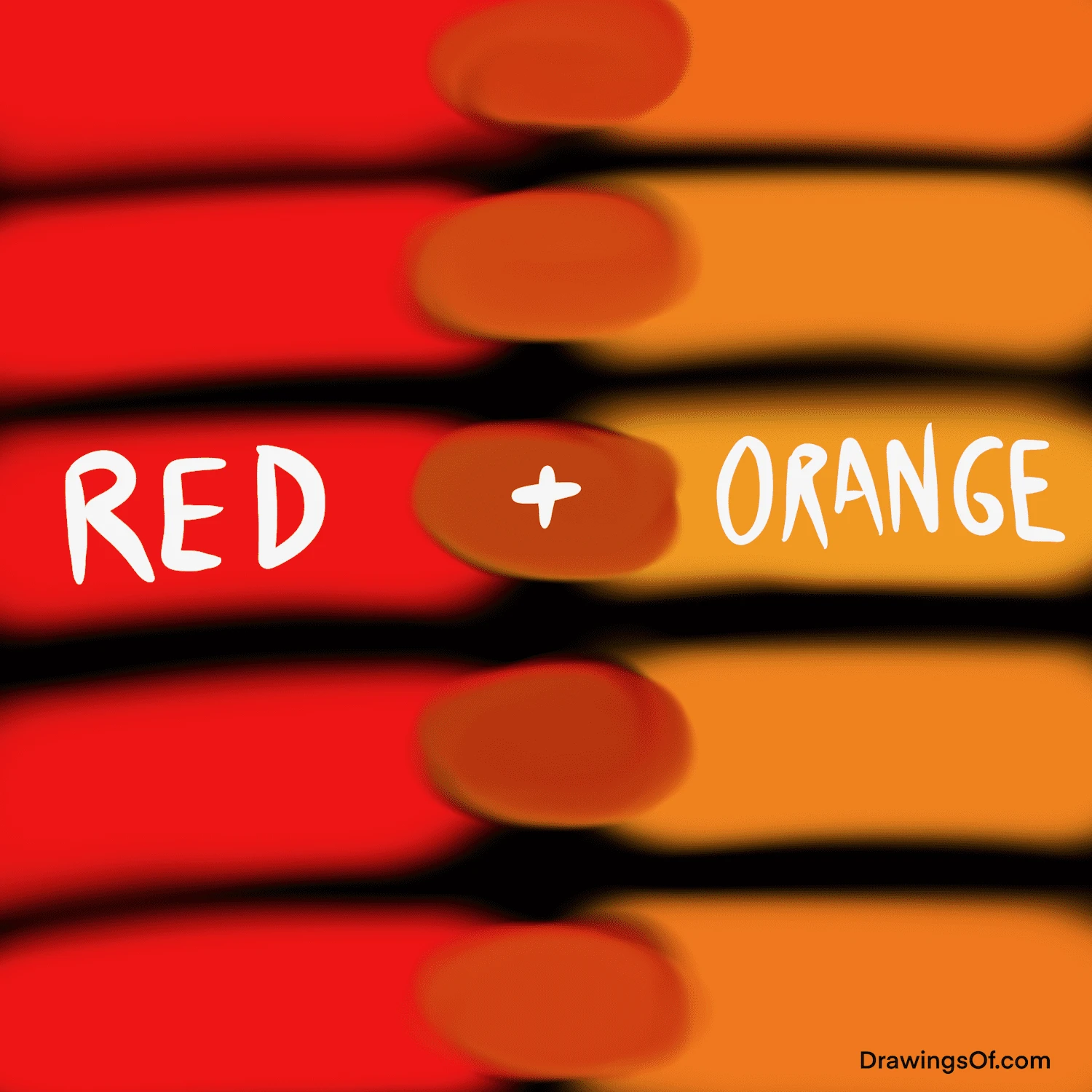
The Psychology of a Warm Palette: Red, Orange, and Their Visual Progeny
The combination of red and orange sits within the “warm” side of the color spectrum. In branding, these colors are utilized to trigger visceral, physiological responses. Unlike the calming, corporate stability of blues or the organic growth associated with greens, red and orange are designed to stir the senses and demand immediate attention.
The Urgency and Power of Red
Red is perhaps the most powerful color in the branding toolkit. It is scientifically proven to increase the heart rate and create a sense of urgency. In a brand context, red signifies passion, energy, and aggression. It is the color of “buy now,” “clearance,” and “stop.” Because red is a primary color with deep evolutionary roots—representing both the life-giving nature of blood and the danger of fire—it commands a primal level of focus.
The Playfulness and Accessibility of Orange
Orange, a secondary color, takes the energy of red and tempers it with the cheerfulness and optimism of yellow. It is perceived as a “friendly” color. While red can sometimes be seen as intimidating or overly aggressive, orange invites the consumer in. It suggests affordability, innovation, and creativity. In the hierarchy of brand psychology, orange is the bridge between the high-stakes intensity of red and the sunny approachability of yellow.
Red-Orange: The Tertiary Powerhouse
When these two are blended—either literally in a logo or figuratively in a brand’s visual system—they create “Red-Orange.” In branding terms, this mixture makes a “Dynamic Disruptor.” This specific hue captures the attention-grabbing power of red without the associated feelings of danger, and the friendly energy of orange without looking “cheap.” It is the color of movement, speed, and modern vitality.
Strategic Branding: When to Blend Red and Orange
Determining whether to use a red-orange palette requires a deep understanding of market positioning. This combination is not a universal solution; it is a tactical choice for brands that want to be perceived as energetic and action-oriented.
Food and Beverage: Stimulating the Appetite
One of the most common applications of the red and orange blend is in the food industry. There is a physiological link between warm colors and the stimulation of appetite. Red signals energy and richness, while orange suggests freshness and flavor. When a brand uses this combination, it is essentially sending a subconscious signal to the consumer’s brain to feel hungry. Fast-food giants have long exploited this “Ketchup and Mustard” theory (often substituting yellow for orange, though the red-orange blend is increasingly popular for “gourmet” fast-casual spots), utilizing the palette to encourage quick decision-making and high turnover.
Tech and Innovation: Energy Without the Corporate Coldness
In the technology sector, many companies are moving away from the traditional “Silicon Valley Blue.” They are opting instead for the warmth of red and orange to signal a human-centric approach to innovation. A brand that utilizes red-orange gradients or accents is positioning itself as a “warm” tech company—one that is creative, agile, and accessible, rather than cold and monolithic. This is particularly effective for apps and software-as-a-service (SaaS) platforms that want to encourage daily user engagement and high levels of “habit-forming” activity.
Retail and E-commerce: Driving Immediate Action
In the digital retail space, the combination of red and orange makes for the ultimate conversion tool. These colors are frequently used for “Call to Action” (CTA) buttons, limited-time offer banners, and notification badges. Because this color combination vibrates with energy, it draws the eye immediately toward the most important element on a screen. For an e-commerce brand, red-orange doesn’t just make a pretty design; it makes a pathway to a sale.
Visual Identity and Design Systems

Beyond the emotional impact, the practical application of red and orange in a brand’s design system requires technical precision. Because both colors are high-chroma (intense), they can easily overwhelm the viewer if not balanced correctly.
Hex Codes and Digital Vibrancy
In modern digital branding, the transition from red to orange is often executed through gradients. With the advent of high-definition screens, gradients allow for a sense of depth and luminosity that flat colors cannot achieve. A common strategy involves using a deep “Signal Red” (#FF0000) transitioning into a “Vivid Orange” (#FFA500). This creates a “sunset” effect that feels natural yet highly digitized, perfect for mobile-first brand identities.
Accessibility and Contrast
A significant challenge in using red and orange together is ensuring accessibility. In web design (WCAG guidelines), colors that are too close in value can be difficult for individuals with color vision deficiencies to distinguish. Professional brand designers solve this by introducing high-contrast secondary colors—often a crisp white, a deep charcoal, or a navy blue—to provide the necessary legibility. When red and orange are used as “accent” colors against a neutral background, their impact is magnified without sacrificing usability.
Gradient Trends in Modern Logos
The “New Wave” of branding has seen a massive shift toward red-orange gradients. This trend was pioneered by major tech platforms looking to modernize their heritage. The gradient represents a brand that is “in flux” or “in motion,” suggesting that the company is not static but is constantly evolving. It makes the brand feel alive.
Case Studies: Brands That Master the Heat
To see what red and orange make in the real world, we can look at global leaders who have built massive brand equity around this warm spectrum.
Mastercard: The Interlocking Strength
The Mastercard logo is perhaps the most iconic use of red and orange (specifically, a red circle and a yellow-orange circle). The area where they overlap—a bright, vibrant orange—represents the intersection of people and commerce. By using these colors, Mastercard communicates energy, connectivity, and the seamless flow of global finance. It transforms a cold financial utility into a warm, vital part of the consumer’s daily life.
Dunkin’: Comfort Meets Speed
Dunkin’ (formerly Dunkin’ Donuts) uses a bold orange and pinkish-red palette. This combination makes the brand feel energetic and “morning-ready.” It differentiates them from the more serious, green-hued aesthetic of Starbucks. For Dunkin’, red and orange make a brand that is about speed, friendliness, and the “everyman” appeal.
Instagram: The Digital Evolution
When Instagram shifted from its skeuomorphic brown camera icon to its current gradient-based logo, it leaned heavily into the red-to-orange transition. This change signaled a shift from being a “photography tool” to being a “lifestyle platform.” The red-orange-purple gradient evokes a sense of creativity, community, and the “golden hour” of photography, making the brand feel infinitely more modern and vibrant.
Beyond the Visual: Building a Brand Voice Around Warmth
When a brand chooses a red-orange identity, the color choice must be reflected in the brand’s voice and personality. You cannot have a high-energy visual identity paired with a stoic, conservative tone of voice.
Tone of Voice: Bold and Energetic
A brand that wears red and orange should speak with confidence. Its messaging should be direct, punchy, and enthusiastic. This is not the color palette for a brand that wants to hide in the background or be seen as a “safe, quiet alternative.” It is for the market leader, the disruptor, and the innovator.

Market Positioning: The Disruptor’s Choice
Ultimately, what the colors red and orange make is a Bold Statement of Presence. In a crowded marketplace where many brands are afraid to offend or stand out, the red-orange combination is a declaration of confidence. It tells the consumer: “We are here, we are energetic, and we have something exciting to offer.”
By understanding the technical, psychological, and strategic implications of this color combination, brand managers can leverage red and orange to create a visual identity that doesn’t just look good, but actively drives engagement and builds lasting brand recognition. Red and orange make a brand that is impossible to ignore.
aViewFromTheCave is a participant in the Amazon Services LLC Associates Program, an affiliate advertising program designed to provide a means for sites to earn advertising fees by advertising and linking to Amazon.com. Amazon, the Amazon logo, AmazonSupply, and the AmazonSupply logo are trademarks of Amazon.com, Inc. or its affiliates. As an Amazon Associate we earn affiliate commissions from qualifying purchases.