
In the competitive landscape of modern branding, color is far more than an aesthetic choice; it is a silent ambassador for a company’s values, a psychological trigger for consumer behavior, and a fundamental pillar of visual identity. When designers and brand strategists ask, “What does the color periwinkle look like?” they are rarely looking for a simple dictionary definition. Instead, they are investigating how this unique hue—a sophisticated marriage of blue and violet—can be leveraged to create a distinct market position.
Periwinkle occupies a rare space in the color spectrum. It sits at the intersection of the stability associated with blue and the creativity inherent in purple. For a brand, choosing periwinkle is a strategic move that signals innovation, calm, and a forward-thinking perspective. Understanding its visual nuances and its application in brand strategy is essential for any business looking to differentiate itself in a saturated digital and physical marketplace.

Defining the Visual Essence of Periwinkle
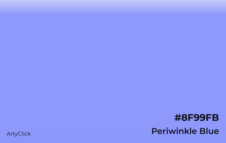
To define periwinkle, one must look at the specific balance of its constituent parts. Visually, periwinkle is a pale, cool-toned color that sits directly between lavender and baby blue. Unlike a traditional sky blue, which is pure and literal, periwinkle possesses a subtle “dustiness” or saturation that gives it an ethereal, almost luminous quality.
The Intersection of Blue and Violet
In technical terms, periwinkle is a light tint of violet-blue. While blue is the most popular color for corporate branding—favored by financial institutions and tech giants for its associations with trust and reliability—it can often feel cold or overly traditional. Violet, on the other hand, suggests luxury, mystery, and imagination, but can sometimes feel too niche or aggressive for a broad audience.
Periwinkle bridges this gap. It retains the professional foundation of blue but softens it with the imaginative spark of violet. This results in a color that looks like the first light of dawn or the petals of its namesake flower. It is approachable yet sophisticated, making it an ideal choice for brands that want to appear trustworthy without being boring.
Digital Precision: Hex Codes and Color Systems
In the realm of digital brand strategy, “looking like” periwinkle must be translated into precise data to ensure consistency across platforms. In the sRGB color space, a standard periwinkle is often represented by the Hex code #CCCCFF, though modern iterations used in high-end UI/UX design often lean toward more vibrant versions, such as #8E97FD or the famous Pantone 17-3938 Very Peri.
Understanding these technical specifications is crucial for brand managers. A periwinkle that looks perfect on a printed business card may shift toward a muddy grey on an uncalibrated smartphone screen if the digital values are not meticulously selected. For a brand identity to remain cohesive, the visual perception of periwinkle must be locked in through rigorous style guides that account for various screen technologies and printing processes.
The Psychology of Periwinkle: Strategic Implications for Brands
Colors are not perceived in a vacuum; they carry historical, cultural, and psychological baggage. When a consumer sees periwinkle, their brain processes a specific set of emotional cues. For a brand strategist, these cues are the building blocks of a “brand personality.”
Balancing Trust and Innovation
Because periwinkle is rooted in blue, it naturally inherits the “trust factor.” However, because it is light and contains a hint of warmth from the red-violet spectrum, it feels more innovative and agile than navy or royal blue. This makes it particularly effective for startups, software-as-a-service (SaaS) companies, and wellness brands.
When a brand utilizes periwinkle, it signals that it is modern and empathetic. In an era where consumers are increasingly wary of “faceless” corporations, periwinkle offers a visual olive branch. It is a color that looks like clarity; it looks like a solution that is both intelligent and gentle. Brands that want to be seen as “human-centric” often lean into this palette to soften their corporate edge.
Modernity and Gender Neutrality
Historically, the color spectrum has been rigidly divided into gendered categories, with blues for masculinity and pinks or purples for femininity. Periwinkle effectively disrupts this binary. It is a gender-neutral hue that appeals to a broad demographic without feeling forced.
In personal branding and corporate identity, this neutrality is a powerful asset. It allows a brand to speak to a universal audience while maintaining a chic, high-fashion sensibility. It doesn’t scream for attention; instead, it commands it through its unique presence on the page or screen. This “quiet confidence” is exactly what many modern lifestyle brands strive to achieve.
Integrating Periwinkle into a Corporate Identity
Integrating a specific color like periwinkle into a brand’s visual identity requires more than just picking a logo color. It involves the creation of an entire ecosystem of supporting hues, typography, and imagery.
Complementary Color Palettes
Periwinkle is a versatile “team player” in design. To make periwinkle truly stand out, brand designers often pair it with:
- Crisp White: For a clean, medical, or high-tech look that emphasizes purity.
- Deep Charcoal or Navy: To provide a grounding contrast that adds professional weight.
- Soft Peach or Terracotta: These “warm” complements create a vibrant, contemporary feel often seen in direct-to-consumer (DTC) lifestyle brands.
- Mint Green: This creates a “cool” palette that suggests growth, health, and tranquility.
The way periwinkle interacts with these colors changes what it “looks like” to the viewer. Against a dark background, it appears to glow, making it excellent for call-to-action buttons or highlights. Against white, it feels airy and expansive, perfect for the background of a minimalist website.
Periwinkle in Minimalism vs. Maximalism
In minimalist brand strategy, periwinkle often serves as the sole “pop” of color in a monochromatic sea of grey and white. This highlights the brand’s focus and precision. In maximalist branding, periwinkle acts as a calming agent, a mid-tone that ties together more aggressive colors like neon yellow or deep magenta.
The adaptability of periwinkle is why it has seen a resurgence in the “Blanding” movement—a trend where brands adopt simplified, sans-serif logos and clean color palettes. Periwinkle provides enough visual interest to prevent a brand from looking generic while maintaining the cleanliness that modern consumers demand.
Market Application and Digital Presence
The rise of periwinkle in professional branding can be traced back to its effectiveness in digital environments. As we spend more time looking at screens, “eye fatigue” has become a genuine concern for UI/UX designers.
Tech Branding and Software Interfaces
Traditional, high-contrast blues can be harsh on the eyes during long periods of use. Periwinkle, with its softer profile, provides a high-readability environment that is less straining. Many productivity apps and meditation platforms have adopted periwinkle-adjacent tones to create a “zen-like” user experience.
Furthermore, periwinkle stands out in the crowded “App Store Blue” landscape. When every social media icon is a shade of Facebook or Twitter blue, a periwinkle icon feels fresh and distinct. It suggests a different kind of tech—one that is focused on the user’s well-being rather than just engagement metrics.
Lifestyle and Luxury Goods
In the physical world, periwinkle is often associated with premium products. It looks like high-end stationery, luxury skincare packaging, and boutique hotel interiors. Because it is a color found in nature (flowers, twilight), it carries an organic premium. It doesn’t look “manufactured” in the way that neon or primary colors do. This makes it an excellent choice for brands that want to justify a higher price point through superior aesthetic presentation and a “lifestyle” promise.
Future-Proofing the Brand with Periwinkle
As trends shift, brands must ensure their color choices remain relevant. Periwinkle was thrust into the global spotlight when Pantone named “Very Peri” the Color of the Year in 2022, describing it as a symbol of the global zeitgeist and the transition we are going through.
Staying Ahead of the Curve
For a brand strategist, using periwinkle is a way to signal that the brand is aware of cultural shifts. It reflects the fusion of our physical and digital lives—the “metaverse” aesthetic—where colors are more fluid and imaginative. By adopting periwinkle, a brand positions itself as a contemporary leader, one that isn’t afraid to step away from the navy-blue safety net of the past.
However, the key to future-proofing is not just following a trend but owning it. A brand must define exactly “what periwinkle looks like” for their specific context. Is it a soft, muted periwinkle for a premium linen company? Or is it a vibrant, electric periwinkle for a cutting-edge AI platform? The strategic application lies in the nuance.

Conclusion
Periwinkle is more than just a color; it is a strategic tool for visual storytelling. It looks like the future—a blend of stability and imagination that resonates with the modern consumer’s desire for both trust and innovation. By understanding its psychological impact, its digital requirements, and its role within a broader visual identity, brands can use periwinkle to create a lasting and meaningful connection with their audience. Whether in the pixels of an app or the texture of a package, periwinkle remains one of the most versatile and evocative hues in the brand designer’s toolkit.
aViewFromTheCave is a participant in the Amazon Services LLC Associates Program, an affiliate advertising program designed to provide a means for sites to earn advertising fees by advertising and linking to Amazon.com. Amazon, the Amazon logo, AmazonSupply, and the AmazonSupply logo are trademarks of Amazon.com, Inc. or its affiliates. As an Amazon Associate we earn affiliate commissions from qualifying purchases.