
In the saturated world of lifestyle apparel and action sports, few brands have managed to maintain a sense of mystery and intellectual depth as successfully as RVCA. Pronounced “REW-ka,” the brand has carved out a unique space that sits at the intersection of surf culture, skate boarding, mixed martial arts, and contemporary art. Unlike many of its competitors who focus strictly on performance metrics or broad market appeal, RVCA was built on a foundational philosophy that dictates every design choice, marketing campaign, and corporate partnership. To understand what RVCA stands for is to understand a sophisticated exercise in brand strategy known as “The Balance of Opposites.”
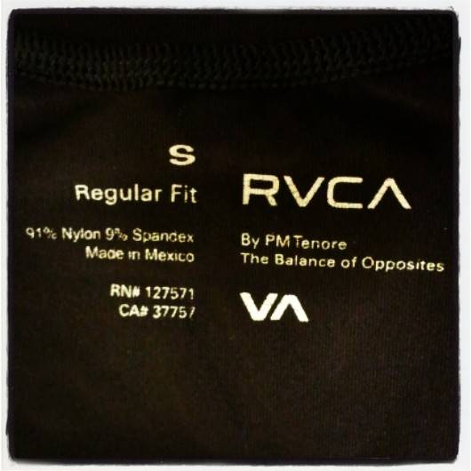
The Etymology and Visual Identity: Decoding the VA Symbol
At first glance, the name RVCA appears to be a stylized acronym or perhaps a word from a forgotten language. However, the brand’s identity is rooted in a clever use of Greek typography and philosophical symbolism. The “V” and the “A” in the name are the most critical components of the brand’s visual and conceptual DNA.
The Literal Meaning and Pronunciation
The brand was founded by PM Tenore in 2001. The name itself utilizes the Roman “U” (written as “V”) to represent what is traditionally the letter “U” in the word “RUCA.” In many cultures, particularly in Latin America, “Ruca” is a slang term for a home, a girlfriend, or a sense of place. However, Tenore’s vision was more abstract. By replacing the “U” with a “V” and focusing on the interplay between the “V” and the “A,” the brand moved away from literal definitions toward a symbolic identity.
The Balance of Opposites
The core of RVCA’s brand strategy is the “Balance of Opposites.” This is visually represented by the “V” and the “A.” The “V” represents Nature, characterized by organic forms, unpredictability, and the raw environment. The “A” represents Industrialization, symbolizing structure, human interference, and the built environment.
This duality is not just a clever design trick; it is the central pillar of the brand’s corporate identity. In a marketing landscape where brands often try to be “one thing” to “one person,” RVCA thrives on the tension between extremes. It suggests that life is not about choosing one side of a binary, but about finding the harmony where they meet. This philosophy allows the brand to exist simultaneously in the gritty world of Brazilian Jiu-Jitsu gyms and the high-brow halls of contemporary art galleries.
Brand Strategy: Transcending the Action Sports Niche
When RVCA launched in the early 2000s, the action sports industry was dominated by giant legacy brands like Quiksilver, Billabong, and O’Neill. These companies focused heavily on the “bro-culture” of surfing and the technical performance of boardshorts. RVCA took a radically different approach to market positioning. Instead of chasing the widest possible audience, they built a brand ecosystem that celebrated subcultures that were previously ignored by the mainstream.
Bridging Subcultures
RVCA’s strategy was to act as a bridge. Tenore recognized that the same individual who spent their morning surfing might spend their afternoon painting in a studio or training in a combat sports gym. By acknowledging the multifaceted nature of the modern creative-athlete, RVCA created a “lifestyle brand” in the truest sense of the term.
The brand’s expansion into Mixed Martial Arts (MMA) was particularly visionary. At the time, MMA was often associated with hyper-masculine, aggressive branding. RVCA brought a minimalist, design-forward aesthetic to the sport, sponsoring world-class athletes like the Mendes brothers and BJ Penn. This move didn’t just sell fight gear; it elevated the sport’s image, aligning it with the discipline and artistry of the brand’s broader philosophy.
The Lifestyle Ecosystem
A key element of RVCA’s brand strategy is the creation of a “lifestyle ecosystem” rather than a mere product line. Their catalog includes everything from technical surf gear and high-performance compression wear to tailored jackets and avant-garde streetwear. This variety is held together by a consistent design language: clean lines, muted palettes, and a focus on silhouettes that feel timeless rather than trendy.
By refusing to be pigeonholed as just a “surf brand” or a “skate brand,” RVCA insulated itself from the boom-and-bust cycles that often plague niche apparel companies. When surf culture’s popularity dipped in the mid-2010s, RVCA remained relevant because of its deep roots in the art and combat sports communities.
The Artist Network Program (ANP): A Case Study in Authentic Collaboration

Perhaps the most significant contribution RVCA has made to modern brand strategy is the Artist Network Program (ANP). In an era where “influencer marketing” is often criticized for being superficial, the ANP stands as a benchmark for authentic corporate-creative partnerships.
Empowering the Creator
The ANP was established to provide a platform for both accomplished and unknown artists who push the boundaries of creative expression. Unlike traditional endorsements, where an artist might simply sign off on a logo placement, the ANP involves deep collaboration. RVCA treats its artists as integral members of the brand family, often giving them complete creative control over capsule collections.
This strategy serves two purposes. First, it ensures that RVCA’s products remain fresh and culturally relevant. By tapping into the unique visions of painters, photographers, and multi-media artists, the brand avoids the creative stagnation that comes with relying on a single in-house design team. Second, it builds immense brand equity within the creative community. When a brand genuinely supports the arts—by funding galleries, publishing magazines, and sponsoring murals—it earns a level of “cool” that cannot be bought with traditional advertising.
Marketing Through Community
The ANP is a masterclass in community-centric marketing. Instead of shouting at consumers through billboards, RVCA embeds itself within the cultural fabric of its audience. By hosting art shows and sponsoring local events, the brand creates tangible experiences. This “bottom-up” approach to brand building ensures that the logo becomes a badge of cultural participation. For the consumer, wearing an RVCA shirt designed by an ANP artist is a way of signaling their appreciation for specific subcultures and artistic movements.
Corporate Identity and Market Evolution
Maintaining a “boutique” feel while operating as a global powerhouse is one of the most difficult balancing acts in business. RVCA’s journey through various corporate structures provides a fascinating look at how a brand can preserve its soul while scaling for mass markets.
From Independent Boutique to Global Powerhouse
In 2010, RVCA was acquired by Billabong International. For many independent brands, an acquisition by a major conglomerate marks the beginning of “brand dilution.” However, RVCA managed to maintain its distinct identity. This was largely due to the leadership of PM Tenore, who remained involved to ensure the “Balance of Opposites” remained the guiding star.
The brand strategy shifted slightly to leverage the distribution power of a larger parent company, but the core messaging didn’t waver. RVCA continued to invest in the ANP and its combat sports divisions, proving that a brand’s identity is not defined by its ownership, but by its commitment to its founding principles.
Maintaining Core Values Amidst Acquisition
When the Boardriders group (which owned Billabong and Quiksilver) was later acquired by Authentic Brands Group (ABG), the stakes for RVCA’s identity were raised again. In the world of high-level brand management, the challenge is to scale without losing the “edge” that made the brand successful in the first place.
RVCA’s success in this area stems from its narrative-driven approach. Because the brand is built on a philosophy (the balance of opposites) rather than a specific product, it has an inherent flexibility. It can adapt to new trends and market demands without contradicting itself. Whether they are producing sustainable boardshorts or high-fashion collaborations, the “V” and “A” serve as a constant reminder of the brand’s dualistic roots.
The Strategic Takeaway: Lessons in Longevity
The story of RVCA offers several critical lessons for brand strategists and marketers. First, it highlights the importance of a “North Star” philosophy. By centering everything on the “Balance of Opposites,” RVCA created a framework that simplifies decision-making. If a project or partnership doesn’t reflect the tension between nature and industry, or art and grit, it doesn’t fit the brand.
Second, RVCA demonstrates the power of subcultural authenticity. By moving beyond the surface level of the sports it sponsors, the brand became a legitimate participant in those communities. Their involvement in MMA wasn’t just about placing a logo on a pair of trunks; it was about understanding the lifestyle of the athlete.
Finally, RVCA proves that design is a powerful tool for brand differentiation. In a world of loud graphics and chasing fast-fashion trends, RVCA’s commitment to a minimalist, art-centric aesthetic has given it a timeless quality. The brand doesn’t just sell clothes; it sells a worldview that celebrates the complexity of the human experience.
What RVCA stands for is more than just a name or a logo. It stands for the idea that opposites do not just coexist—they require one another. It is the recognition that the artist needs the athlete, the industrial needs the natural, and the brand needs the community. By staying true to this balance, RVCA has moved beyond the realm of apparel to become a permanent fixture in the global cultural landscape.
aViewFromTheCave is a participant in the Amazon Services LLC Associates Program, an affiliate advertising program designed to provide a means for sites to earn advertising fees by advertising and linking to Amazon.com. Amazon, the Amazon logo, AmazonSupply, and the AmazonSupply logo are trademarks of Amazon.com, Inc. or its affiliates. As an Amazon Associate we earn affiliate commissions from qualifying purchases.